The advanced mode in KColor is designed for users who want full control over color harmony, aesthetic variation, and accessibility. It combines traditional color theory with customizable generation settings, perfect for building refined palettes for design systems, data visualizations, or branding.
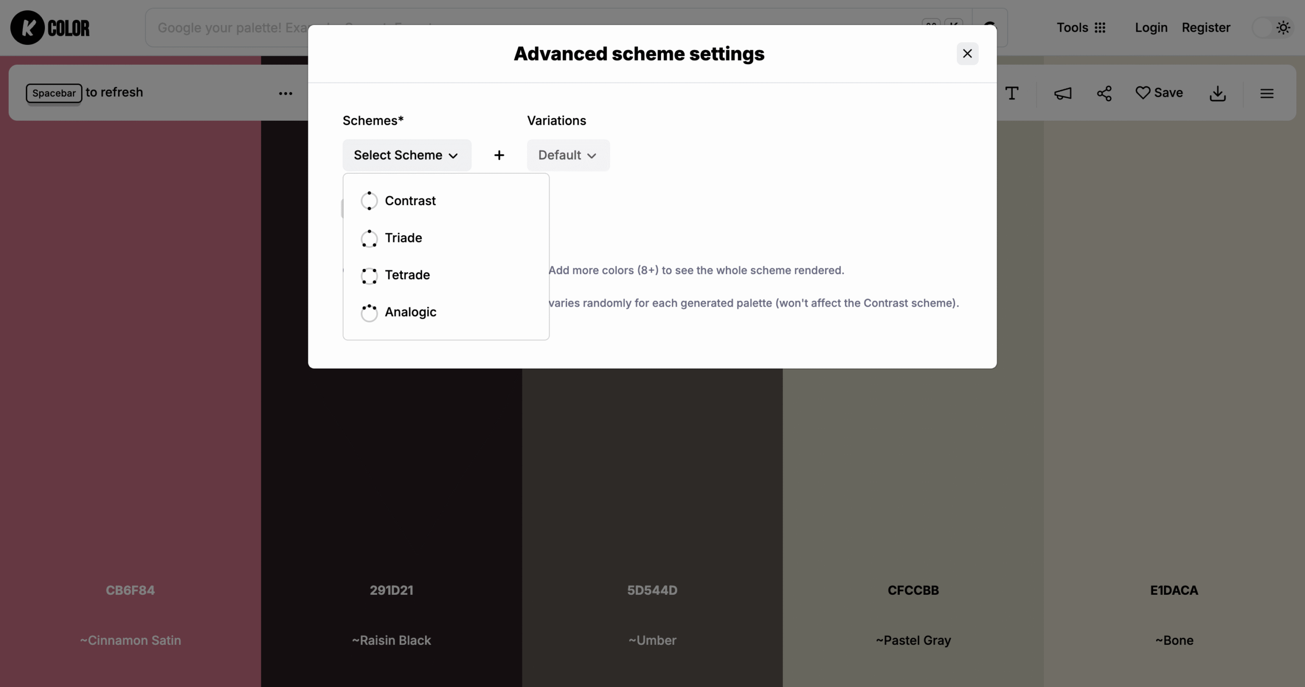
Color schemes available
In this mode, you can choose from multiple color harmony options including:
- Contrast:Highly differentiated colors
- Analogous:Colors adjacent on the color wheel
- Triadic:Three evenly spaced hues
- TetradicTwo complementary pairs
Each scheme is mathematically balanced to ensure visual cohesion and aesthetic consistency.
Visual tone variations
After selecting a scheme, KColor lets you fine-tune the look with visual tone presets:
- Pastel
- Soft
- Light
- Hard
- Pale
These variations adjust saturation and brightness to help match your brand’s mood or UI needs.
Web safe filter
For maximum compatibility across devices and browsers, you can toggle a web-safe filter to limit output to colors that display consistently on all screens. This is especially useful for designers working with legacy systems or broad accessibility standards.
How to use advanced mode in KColor
Choose advanced mode in the generator panel, select your desired scheme and variation style, then preview the palette.
Use cases for advanced color schemes
Advanced mode is ideal for branding, complex UI interfaces, visual storytelling, or any scenario where strategic color planning matters. Designers use it to create bold contrast palettes, harmonious triadic schemes, or subtle analogous combinations.
Next steps
Switch to advanced mode to explore color harmonies like never before. With intelligent presets and full control over variations, KColor helps you craft palettes that stand out while staying accessible and balanced.