So, you are cooking up a website, building the next big startup brand, or crafting a UI that’s gonna make people say “whoa.” Let’s talk color, because it’s not just pretty pixels, it’s one of your sharpest tools in the design shed. The right palette sets the vibe, boosts usability, and ties everything together like a well-dressed dinner guest. In this guide, I’ll show you how pros generate color combos for whatever creative they are working on, using some slick modern tools, inclusing owr very own color palettes generator.
Why Color Palettes Matter
Color isn’t just decoration, it sets the mood, shapes your brand’s identity, and influences how people experience your design. Get the palette right, and everything feels cohesive and intentional. Get it wrong, and even the best ideas can end up looking a little off.
Define Your Design Goals
Before you jump into picking colors, it’s key to get clear on what your design is really about. Color isn’t just about looking good, it’s a powerful way to communicate, spark emotion, and guide how users interact. When you know your goals from the start, choosing colors that back up your message and boost the user experience gets way easier.
- What is the purpose of the design?
- Who is the target audience?
- What emotions or reactions should the design evoke?
- What action or impression should users take away?
Example 1Startup Tech Landing Page
-
GoalCommunicate innovation, trust, and simplicity.
-
AudienceProfessionals, investors, and early adopters.
-
Suggested PaletteCool tones like deep blues for trust and credibility, with bright accents like aqua or green to signal innovation and action.
Example 2Meditation or Wellness App
-
GoalPromote calmness, clarity, and mindfulness.
-
AudienceAdults seeking balance, relaxation, or mental health support.
-
Suggested PaletteSoft, desaturated hues like pale blues, muted greens, and lavender that create a soothing visual atmosphere.
Example 3Luxury Fashion Brand Identity
-
GoalConvey elegance, exclusivity, and premium value.
-
AudienceAffluent, fashion-conscious consumers.
-
Suggested PaletteMonochrome tones like black and charcoal, paired with metallics (gold, silver) or soft neutrals like beige for sophistication.
Example 4Non-Profit Organization Website
-
GoalInspire empathy, action, and connection.
-
AudienceDonors, volunteers, and community members.
-
Suggested PaletteWarm and earthy colors like coral, amber, or soft green to evoke care, community, and nature.
Example 5Kids’ Educational App
-
GoalCreate a playful, engaging, and energetic experience.
-
AudienceChildren aged 5–10 and their parents.
-
Suggested PaletteBright primary colors (red, blue, yellow) combined with fun secondaries like orange and purple for excitement and clarity.
Start with a Base Color
Begin with one color that represents the main emotion or identity you want to convey. For branding, this might be your primary brand color.
Use a tool like kcolor.co to quickly generate shades, tints, and harmonious palettes from your base color.
Choose a Color Scheme
Consider using proven color harmonies:
- Monochromatic – variations of a single hue (clean and minimal)
- Analogous – colors next to each other on the color wheel (harmonious)
- Complementary – colors opposite on the color wheel (high contrast)
- Triadic – three evenly spaced colors (balanced and vibrant)
Use Shades, Tints, and Tones Strategically
Adjusting brightness and saturation gives you a range of variations without losing cohesion. This helps create visual hierarchy and accessibility.
Test Accessibility
Ensure your palette meets accessibility standards:
- Check contrast ratios (especially for text on backgrounds)
- Use an online WCAG 2.0 contrast checker or built-in features in generators
Learn more about W3C’s Web Content Accessibility Guidelines (WCAG) 2.0
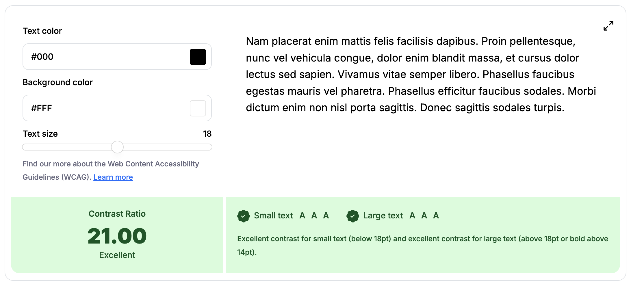
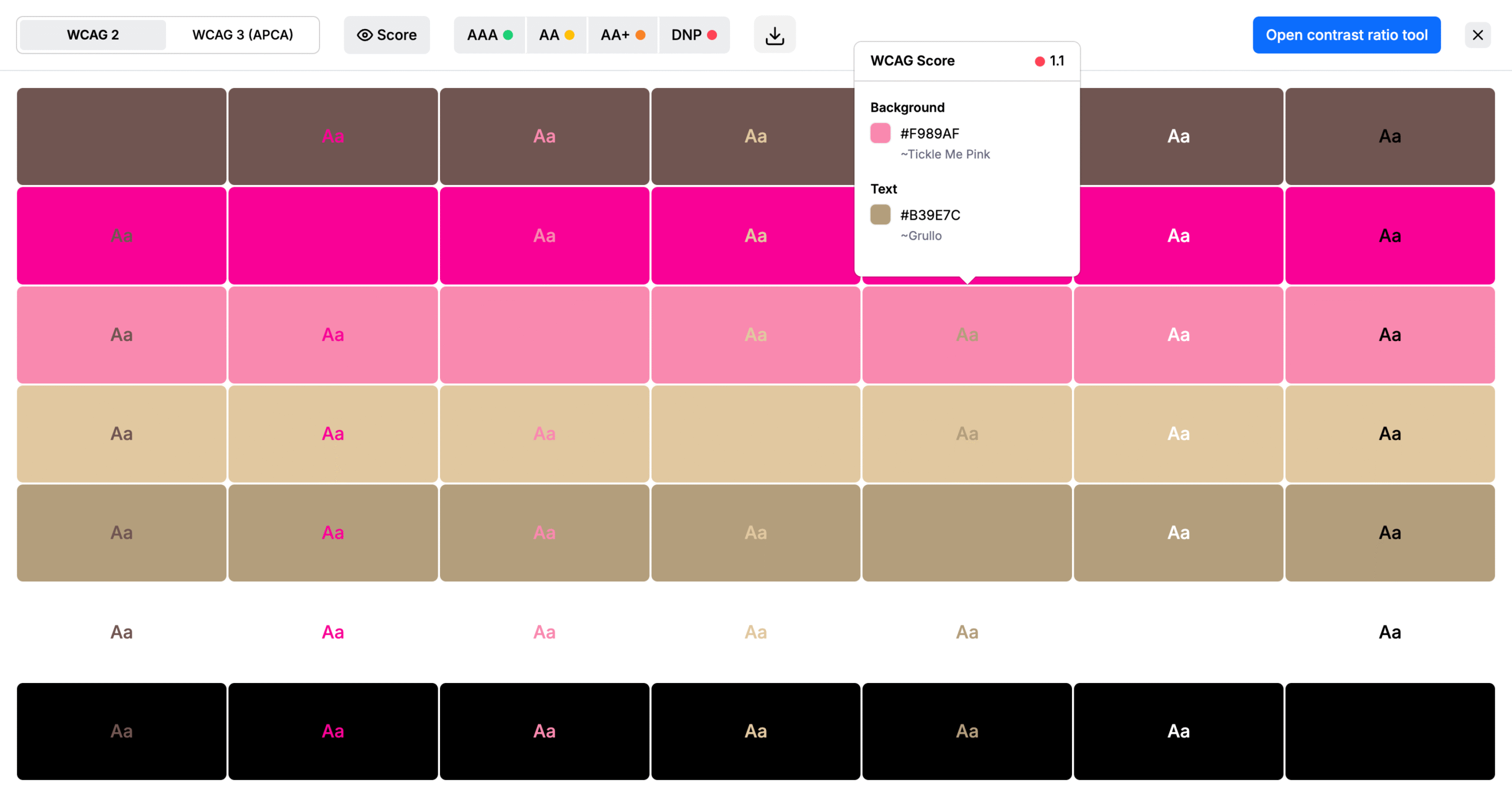
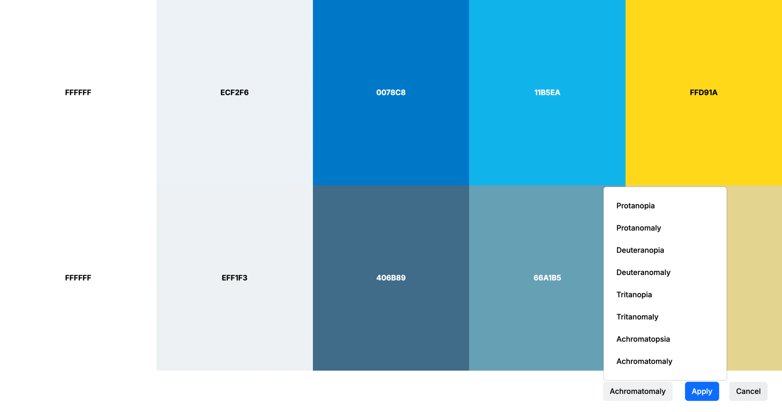
Before you lock in your palette, it’s super important to make sure your colors work for all users, including those with color blindness. Tools like Color Contrast Checkers and color blindness simulators can help you see how your design looks to people with different types of visual impairments. Aim for strong contrast, avoid relying solely on color to convey meaning, and make sure everything stays clear and readable. Great design isn’t just beautiful, it’s inclusive.
Preview on Real Interfaces
Test your palette on UI components, mockups, or branding assets to see how the colors interact in context. Tools that let you preview live can save hours of guesswork.
Best Practices for Palette Generation
- Limit the number of core colors (usually 3–5): one primary, one or two secondary, and one or two accent colors.
- Always consider light and dark themes: modern UIs often require both.
- Think beyond aesthetics: Color can guide users, show interactivity, and indicate status (like success or error).
- Name your colors meaningfully in design systems (e.g.,
primary,accent,success) instead of just hex codes. - Save and document your palettes for consistency across projects and teams.
Design Use Cases for Palettes
-
Web + App UI DesignPrioritize accessibility, clarity, and contrast.
-
BrandingFocus on emotional tone and uniqueness.
-
Print DesignConsider how colors convert in CMYK versus digital (RGB).
-
Social Media GraphicsChoose bold, vibrant tones that stand out on feeds.
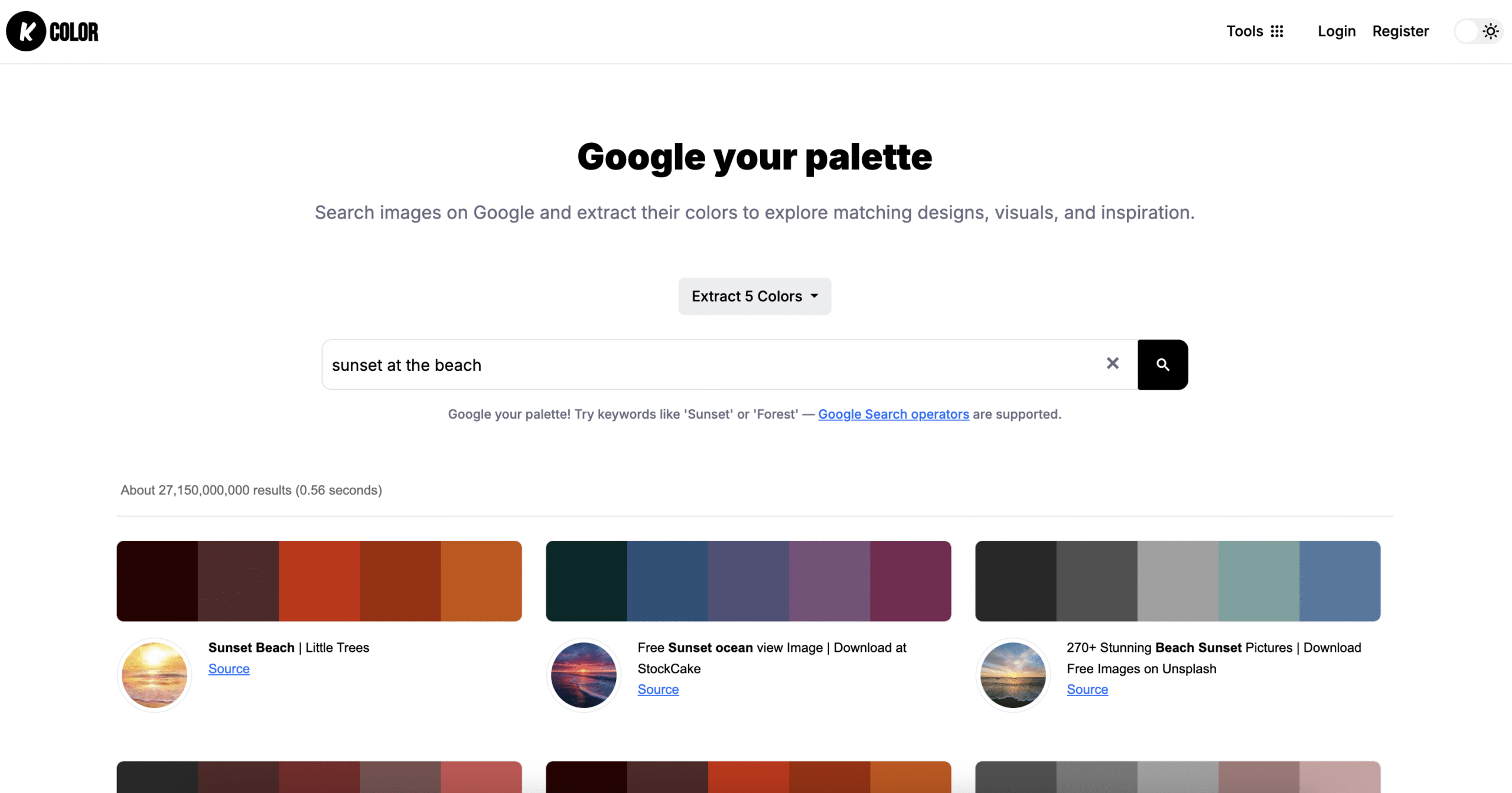
Your Secret Weapon for color palettes inspiration
Sometimes, the best color ideas don’t come from staring at a blank screen—they come from the world around you. That’s where tools like our Color Extractor from Google Images step in.
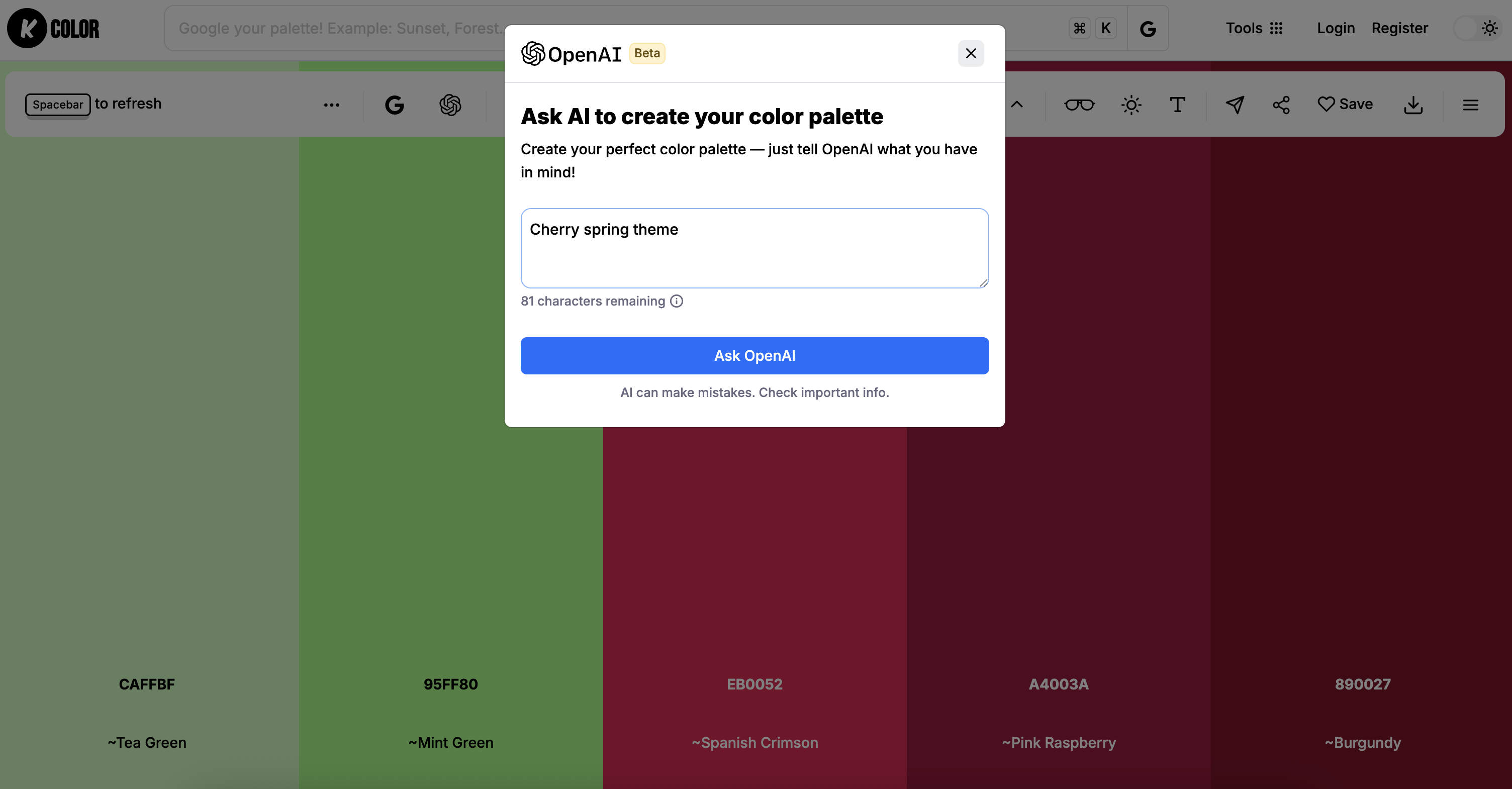
AI tools like KColor AI can help generate fresh color ideas or suggest palettes based on your project’s vibe. It’s like having a creative partner who’s always ready to toss out cool color combos you might never have thought of.
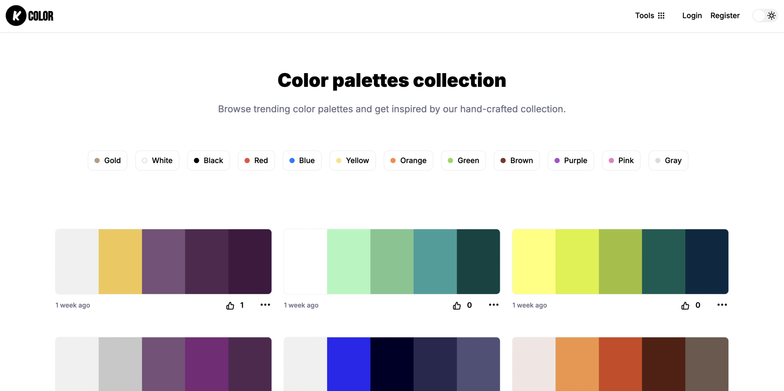
Not sure where to start? Dive into our Color Palettes Collection , a curated library full of hand-picked combinations for all kinds of vibes, from bold and vibrant to calm and minimal. Sometimes you just need a spark of inspiration, these palettes are ready to go. Browse, pick your favorite, and make it your own.
So don’t just guess—use these clever tools to fuel your inspiration and make your palettes pop.
Choosing the right color palettes doesn’t have to be intimidating. By understanding color theory, setting clear goals, and using modern tools like kcolor.co, you can generate beautiful, functional palettes for any design purpose.